|
Vertical Divider
Keith & Dianne HambrookKalabus Arts:
Showcasing art created in rehabilitation programmes in Vanuatu Correctional Centres |
|
Vertical Divider
Kalabus Arts:
|
KEITH HAMBROOK
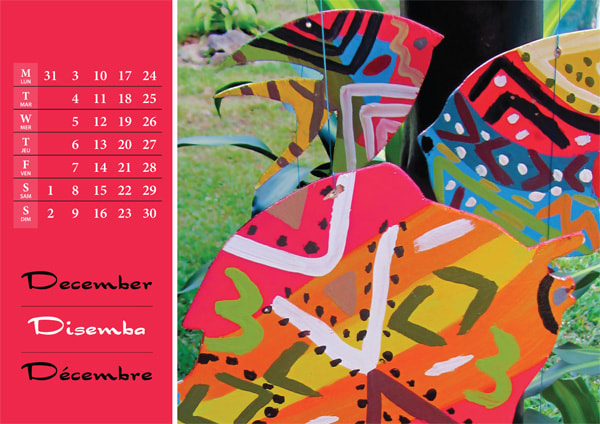
Art Rehabilitation Programme Advisor March 2010 - June 2013 DIANNE HAMBROOK Graphic Design & Marketing Advisor June 2012 - June 2013 I was stunned by the calibre of the work that the detainees in Keith’s art group where producing. Without exception the participants in the art rehabilitation programme at the Mens’ Low Risk Correctional facility had never painted before - and it showed. There was an authentic naivety to their work which trained artists can't replicate. Within the confines of the nakamal in Stade Prison these men painted their home islands from memory with childlike simplicity. Keith was careful not to taint this. His approach was to enable creativity rather than to teach technique. He encouraged the men to connect with the process and enjoy the experience. In halting Bislama he told them to find their “inner pikinini” (inner child) and they appeared to understand and embrace the concept. Budget constraints and limited availability of stocks in Port Vila meant the most basic of materials were used: plywood, house paint and the kind of cheap brushes that make artists want to weep. Keith was only able to provide the primary colours which, along with a rudimentary colour theory tutorial, led to the discovery that yellow mixed with blue makes green. The art group delighted in this. The islands of Vanuatu are mostly shades of lush, verdant green and it’s a favourite colour. I immediately saw huge potential in the paintings. As a graphic designer I knew how to enhance and present them, while the marketer in me kept insisting that this was a perfect way to showcase the reforms being implemented in Vanuatu Correctional Services at that time. My idea was to create an art calendar with a different painting for each month, and a couple of additional pages providing information about the other rehabilitation programmes that were running such as woodworking, gardening and cooking. It was easy to get buy-in from the Technical Advisor and Director of Correctional Services. The paintings spoke for themselves. Funding was made available to produce the calendars which were printed in Port Vila and distributed among stakeholders. They were so well received that we repeated the process the following year using twelve new paintings. The offering expanded to include art cards, Christmas cards and gift tags. We decided they needed to be branded and Kalabus Arts was born. “Kalabus” is the Bislama word for “prison”. The logo was as natural a progression as the name. Keith had been asked to extend the art rehabilitation programme to the Women’s Correctional Centre, which he found to be a totally different dynamic to Stade. It was a smaller group and the women weren't comfortable producing individual paintings, preferring to collaboratively decorate fish cut from plywood. They created hundreds of these, covering the gate of the facility with them and making others into mobiles. From the piles of vibrant colours and patterns one fish leapt out and said ‘pick me’. It became the logo. The first Kalabus Arts exhibition held at l'Espace Alliance Francaise in December 2012, was a great success. Twenty five paintings, all the cut-out fish and mobiles were sold. The calendars and art cards proved popular too, as did the sculptures and furniture produced in the woodworking programme. We received good media coverage, achieving our primary objective of increasing public awareness of rehabilitation initiatives and the role of Probation Services in the Vanuatu Correctional Centres. As an added bonus, we were able to put profits from the sales towards funding materials and covering printing costs. |
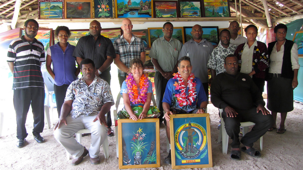
Our end-of-assignment farewell, fittingly held in the nakamal at Stade Low Risk Correctional Centre where Keith ran art classes
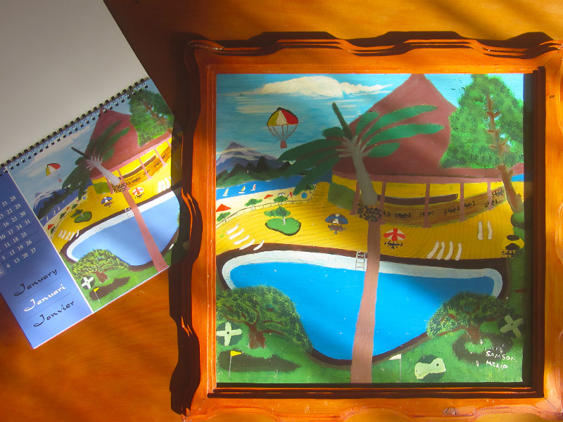
This painting depicting a resort in Port Vila was chosen for the month of January in the 2013 calendar
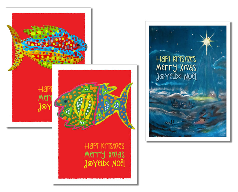
Kalabus Arts Christmas cards
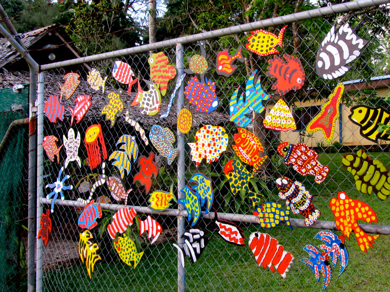
Fish decorating the gate of the Women's Centre

A selection of Kalabus Arts greeting cards
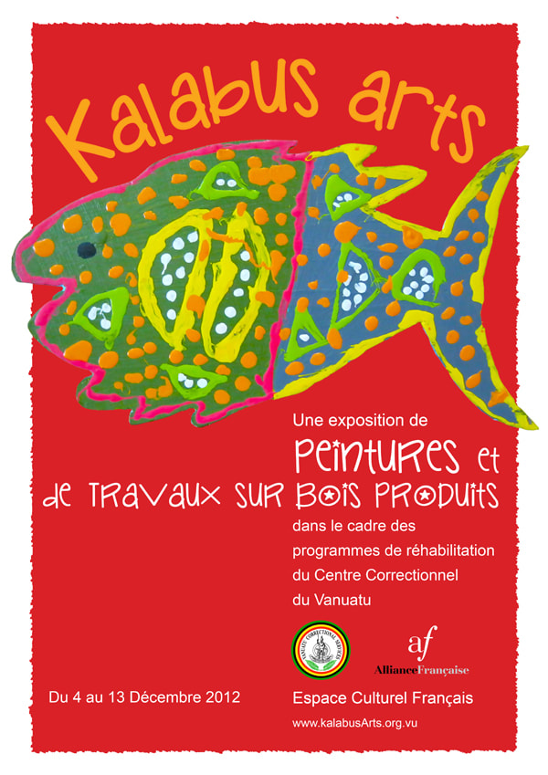
French version of a poster advertising the first Kalabus Arts exhibition in Port Vila
|
|
Vertical Divider
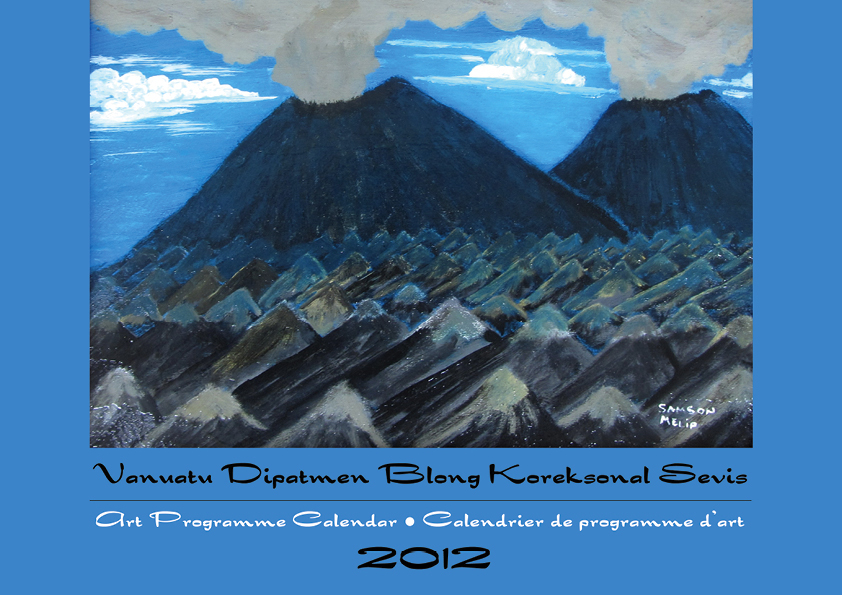
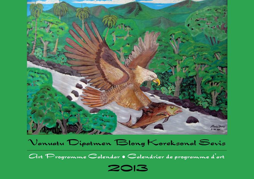
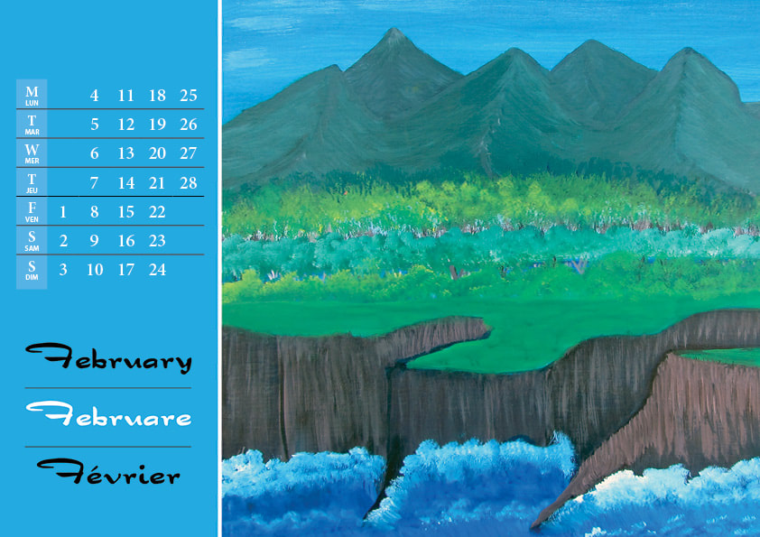
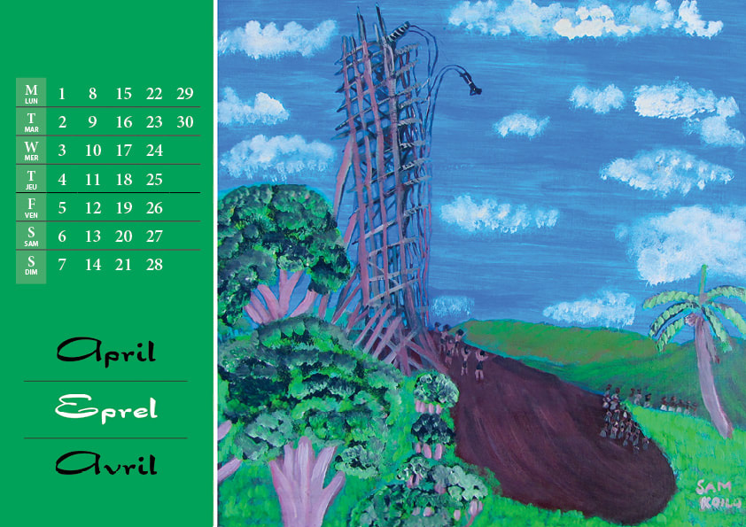
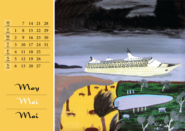
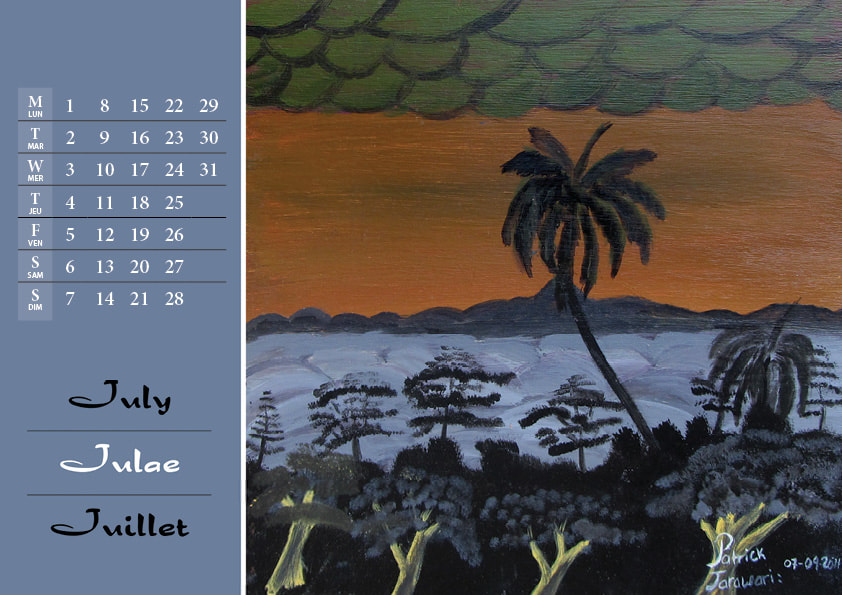
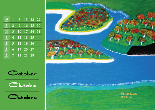
Kalabus Arts calendars & cardsA selection of pages from the Kalabus Arts 2012 and 2013 calendars (Click on the covers to download pdfs of the complete calendars) |
|
|
|
|
